


How to trade chart patterns?
Have you ever looked at the chart and had a feeling of Deja-Vu? A feeling that the chart or candlestick pattern is repeating itself in some ways? This is because certain movements in the market keep repeating and for this reason, there are candlestick and chart patterns. Their history can be dated back to the very first discovery of Japanese candlesticks and nowadays they are a necessary part of technical analysis.
On the internet, you may find unlimited information and study materials on this matter, and although there may be slight differences in each of the explanations, it is important to understand the most basic ones. In this article, we will discuss the most popular chart patterns that you can include in your trading strategy.
Reversal Chart Patterns
Reversal chart patterns are technical indicators that traders use to identify potential buying and selling opportunities in the markets. Reversal chart patterns are created by the movement of price and the corresponding trading volume to identify changes in the current trend. Some of the most common reversal chart patterns include head and shoulders, double and triple tops/bottoms. Each of these patterns has a unique shape and provides a potential trade opportunity when the price breaks out from the pattern. It is important to note that these patterns alone should not be used as definite indicators for an entry and should be considered as part of the technical analysis.

Double Top/Bottom
Double top is a popular chart pattern which is used to identify potential trend reversal. It is identified when the price of an asset shows two consecutive peaks at the same or similar level. This pattern is considered to be a sign of bearish reversal, as the asset’s price fails to break above the previous peak. The double top chart pattern is made up of two peaks with a valley in between. The peaks signify a resistance level, meaning that the asset’s price struggles to break through it. The valley between the two peaks is called the “neckline”, and when the price of the instrument breaks below this neckline, it is seen as a signal of the reversal pattern. The double top formation is generally preceded by an uptrend, and it marks the point of exhaustion of the asset’s buyers. As the buyers are unable to push the price higher, sellers will take control of the trend and push the asset’s price lower.

Double bottom is a technical chart pattern used by traders to predict a bullish reversal in the instrument’s price action. The pattern is composed of two consecutive troughs that form a “W” shape on the chart. The first trough marks the bottom of the instrument’s previous trend, while the second trough marks the bottom of the new trend. In between the two troughs lies a peak, which marks an uptrend that is likely to follow. The double bottom pattern is identified by traders when the instrument’s price action reaches the second trough and begins to rally. It is considered an indication of strength when the security’s price breaks out of the pattern to the upside.

Triple Top/Bottom
The triple top chart pattern is a technical analysis charting pattern used to identify potential reversal in an instrument’s price. It is characterized by three near-equal highs followed by a break below the support level. The triple top pattern is considered to be one of the most reliable reversal patterns in technical analysis, as it requires three distinct price peaks before the trend reverses. The pattern usually starts with an upward trend that reaches three distinct prices. After the third peak, the price breaks the support level, which indicates a possible trend reversal. The trend reversal is confirmed when the price breaks the support level again and falls below the previous low. The triple top pattern is an important indicator of a potential trend reversal and can help traders determine when to enter and exit positions. It is important to remember that the triple top pattern is not a sure-fire signal of a trend reversal and should be used with other indicators.

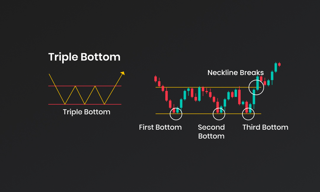
A triple bottom chart pattern is a technical analysis indicator which is formed when an instrument’s price records three consecutive lows at approximately the same level. The triple bottom chart pattern indicates that sellers have tried to push the price lower but have been met with strong buying pressure that stops the price from falling further. This pattern, if confirmed, can signal potential reversal in the asset’s price and an increase in the overall uptrend.
Head & Shoulders
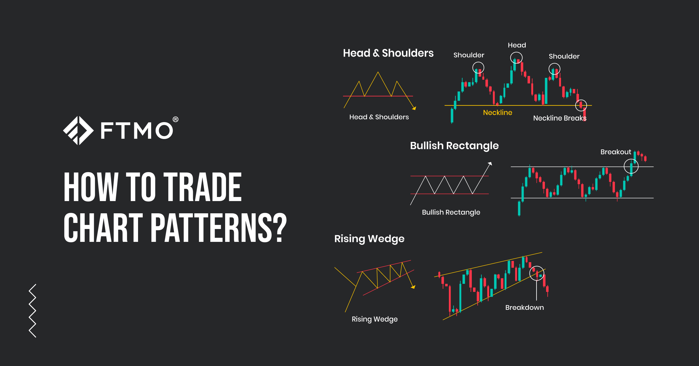
The head and shoulders chart pattern is a technical indicator that depicts a price decline and subsequent reversal. The pattern consists of three peaks—two smaller peaks on either side of a larger peak in the middle. The peaks are called “shoulders” and the middle peak is called the “head.” The neckline is a line drawn along the valleys that connect the shoulders and head. When the price falls below the neckline, it indicates a potential reversal in the trend. Traders use the head and shoulders pattern to identify potential entry and exit points in the market.

Inverted Head & Shoulders
An inverted head and shoulders chart pattern is one of the common chart patterns found in technical analysis. It is generally considered a reversal pattern that typically signals an upcoming bullish trend after a period of a bearish trend or a period of consolidation. The pattern is formed by three successive price bottoms, with the middle bottom (head) being the lowest, and the two other bottoms (shoulders) being higher on both sides. The pattern is completed when the price crosses above the neckline, which is formed by connecting the high points of the two shoulders. This indicates that the bearish trend has reversed and the price is likely to continue its upward move.

Continuation Patterns
Continuation chart patterns are technical indicators used in trading that can provide clues about the direction of the asset’s price. They provide a way to determine when an asset’s current trend is likely to continue. These patterns are formed on charts, usually through a series of candles or bars, and can be used to recognize potential buy or sell signals. Common examples of continuation chart patterns include rectangles, triangles, flags, and pennants, as well as cup and handle patterns. These patterns are important to consider when trading, as they can help traders identify potential buy and sell signals in the market.

Bearish/Bullish Rectangle
A bearish rectangle chart pattern is a trading pattern that occurs on a chart, when prices move within a rectangular top and bottom range. This range is formed by two parallel, horizontal trend lines that act as support and resistance, respectively. After a period of consolidation, the price breaks out of the pattern in a downward direction, signaling that a continuation of the existing bearish trend is likely. The bearish rectangle chart pattern is considered a reliable signal of a bearish price trend and is often used by technical traders to make trading decisions.

A bullish rectangle chart pattern is a type of technical analysis pattern that signals a potential trend continuation and serves as a great trading opportunity. It is formed when price movements create two horizontal lines which intersect at two opposite ends, creating a “rectangle” shape. The price action appears to “consolidate” within the rectangle area and typically breaks out of this area in the direction of the ‘bullish’ sentiment. A bullish rectangle chart pattern is typically seen as a sign of strength and a likely indication that the trend is set to move upwards. To confirm a breakout, the price should close above the upper resistance line of the rectangle chart pattern. In short, a bullish rectangle chart pattern is an indication of an uptrend and can be used to spot potential trading opportunities.

Bearish/Bullish Flag
A bearish flag chart pattern is a technical analysis term used to describe a price formation that is typically seen after a strong directional move downward. This price formation is characterised by two declines separated by a brief consolidating retracement period. The flagpole forms at an almost vertical panic price drop, as bulls get blindsided by the sellers. After a bounce, the flag has parallel upper and lower trendlines, which form the flag. The initial sell-off comes to an end through some profit-taking and forms a tight range. This illustrates that there is still selling pressure present, although traders are also entering long positions looking for a reversal. During the consolidation, traders should be prepared to take action should price break down through the lower range level and/or make a new low. When the lower trendline breaks, it typically triggers panic sells as the downtrend resumes another leg down.

A bullish flag chart pattern in trading is a technical chart pattern that signals a likely increase in prices. It is characterised by a sharp countertrend (the flag) that follows a short-lived trend (the pole). This pattern resembles a flag with masts on either side and is followed by a substantial increase in the upward direction. The primary goal of a bull flag pattern is to enable traders to profit from the market’s current momentum, and after the pattern is spotted, traders use the volume indicator to predict the direction of the trend and determine the entry point. The breakout from this pattern often results in a powerful move higher, measuring the length of the prior flag pole. It is considered to be a formidable pattern to trade, as long as all elements are in place.

Bearish/Bullish Pennant
A bearish pennant chart pattern is a technical analysis indicator that typically forms after a sharp price decline, followed by a period of consolidation. This consolidation period can last from one to several weeks, giving traders a chance to observe the pattern closely and make an informed decision. When the price breaks out of the triangle of the pattern, it indicates that the bearish trend is likely to continue. Traders may enter short positions in the market when the price breaks out of the triangle. It is important to be careful when trading bearish pennant patterns, as false breakouts can occur and result in losses. It is also important to pay attention to other indicators, such as volume and momentum, to confirm the pattern.

A bullish pennant is a continuation chart pattern which forms when the price of a security consolidates in a symmetrical triangular pattern before breaking out in the same direction as the previous trend. The pattern is composed of two consecutive pennants, with the second pennant having a smaller range than the first. During the formation of the pattern, the price will usually move in a narrow range and form two converging trend lines. The pattern typically appears during an uptrend, and when the price breaks out above the upper trend line, it signals a continuation of the preceding uptrend.

Cup & Handle / Inverted Cup & Handle
It is a chart pattern that looks like a cup with a handle and is used to identify areas of support and resistance. The pattern starts with a cup formation, which shows a period of gradual increase in price, followed by a slight decrease. After the decrease, the price moves higher, forming the handle. When the price of an instrument breaks above the high of the handle, it is considered a buy signal.

Inverted cup and handle is a chart pattern which is identical to the cup and handle, except for the fact that once it forms bearish trend is expected to continue. This is the reason this chart pattern is one of the continuation chart patterns as it represents the retracement of the higher trend. If the price of an instrument breaks the support level of the handle, traders may anticipate a bearish trend.

Bilateral/Neutral Patterns
Symmetrical triangle
A common chart pattern observed in technical analysis is a symmetrical triangle. It occurs when an asset’s price moves in a converging triangle pattern and looks like a neutral pattern, which means that regardless of the previous price movement, the asset’s price is anticipated to move forward in any direction. Traders will typically take long and short positions as the price moves between the two trend lines and develops toward the pinnacle of the pattern, which is commonly found in strong trends. Additionally, price targets can be defined using the symmetrical triangle chart pattern.

Rising wedge
A rising wedge chart pattern is formed by two trend lines that slope upward, connecting a series of lower highs and higher lows. A rising wedge chart pattern typically indicates a bearish reversal in momentum, as the stock or commodity prices move lower after the pattern is complete. The resistance line is the higher trend line, and the support line is the lower trend line. The formation of a rising wedge chart pattern can take several days, weeks, or even months. When the price crosses through the lower trend line, indicating a change in momentum from bullish to negative, the pattern is said to be finished. When the price fails to reach a new peak and instead moves downward, the pattern may also be deemed to be finished. Once the pattern is complete, traders look for opportunities to go short in anticipation of further price declines.

Falling wedge
A falling wedge chart pattern is a technical analysis indicator used in trading to identify potential entry signal. It has the appearance of a wedge because of two trendlines that are convergent. Given that the converging trendlines show weakening bearish momentum, the pattern is thought to suggest a possible bullish reversal. The two trendlines can converge over a time of several days, few weeks or months and must stay within the wedge’s confines the entire time. The pattern is void if the price shifts outside of the wedge. Traders watch for a price breakout from the upper trendline once the pattern is verified. This suggests that the market will eventually turn bullish as buyers take over.

Final words
Some traders are heavily against trading with chart patterns and there are also some traders that would swear by this technique. Chart patterns are one of the basic theories of technical analysis as they provide a first signal in the probability of next price movements. However, relying purely on chart patterns is not sufficient as there are other factors that affect the price movement of instruments. It is needless to say that criteria to enter a position must be clearly defined with a proper fundamental and technical analysis. Trade safe!


- As many Free Trials as you need
- Up to $200,000 account
- No time limit
Worldwide Reviews