You don't like candles? Try other types of charts
Candlestick charts are certainly the most widely used type of graphical representation of price movements used by traders in their technical analysis today. However, it is far from being the only method that traders can use in their strategies.
Graphical representations of what is happening in the markets are essential for traders using technical analysis. However, each trader may be suited to a different view, or different information may be vital and important to each trader. Different types of charts take into account other factors besides price, such as time, volume or trader activity, which then influence the final form of the chart. Today we'll take a brief look at some of those that aren't exactly common, but you may encounter them in some cases.
The most commonly used charts take into account, in addition to the price itself, a certain time interval within which the price moves in one direction or the other. These include candlestick, bar and line charts, but also the lesser known Heiken Ashi chart type.
The candle chart is very popular among traders due to the fact that within a single candle, the trader has instant information about what the opening, closing, maximum and minimum price was within a given time interval. The colour of the candle will also show him which direction the market moved in that interval.
Bars and lines
The bar chart, for example, which was most commonly used before the widespread use of candlestick charts, works on a similar principle. It shows the same information as a candle chart, but instead of a candle, it shows only vertical lines, the ends of which represent the maximum and minimum prices. The direction of price over a given time interval is less clear than on a candle chart, but for some traders this type of chart may be better for showing volatility in the markets.
An even simpler type of chart is the line chart, which shows only a series of closing prices connected in the form of lines. This type of chart does not tell the trader anything about volatility over a given time period because it does not depict the opening, maximum or minimum price. It is thus more suitable for tracking trends on longer time frames, but is not well suited for use in technical analysis.
Heiken Ashi
The Heiken Ashi chart is at first glance very similar to the classic candlestick chart, but there are some fundamental differences between them. The author of this chart, as with candlestick charts, is Japanese rice trader Munehisa Homma. Unlike the classic candle chart, the candles on the Heiken Ashi chart do not depict the actual price development over a given period, but work with price averaging. Thus, the closing value of a candle is the average price of the current candle and is calculated as:
(open + high + low + close) / 4
The opening value is then the mean value of the previous candle and is calculated as:
(the open of previous bar + the close of the previous bar) / 2
The maximum of the candle is then the higher of the two values - either the maximum or the opening price of the current candle.
The minimum of the candle is then the lower of the two values - either the minimum or the opening price of the current candle.

The Heiken Ashi chart thus looks more sleek because it eliminates the noise in the market, which makes it more suitable for determining the main trend and momentum in the market. On the other hand, it must be taken into account that it does not show the real opening and closing prices. Just like on classic candlestick charts, some basic principles of technical analysis or price action can be applied on them, as long as the trader is aware of its limitations.
Tick chart
Time, or pre-determined time frames, may not be the most important factor influencing what happens in the markets. For many traders it is an unimportant variable and a much more important factor affecting the price of an instrument is, for example, the activity in the markets. Here we can include various graphical tools showing the volume in the markets (order flow, or footprint charts), or tick charts, for example.

Simply put, one tick represents one trade executed on the chart, so it does not take into account time, but actual market activity. Unlike volume-based charts, which are based on how many contracts are traded in the market, tick charts are plotted differently because multiple contracts can be paired within a single trade. Thus, on a T50 chart, one candle is formed after fifty trades have been executed. The main advantage of these charts is the fact that they eliminate the period when there is minimal activity on the markets, because at that time not too many candles are drawn and the trader has a better overview of the market dynamics.
Renko and Range charts
The next group of charts are those where the main factor for their plotting is the price itself. This group of charts includes, for example, the Renko chart, which we wrote about some time ago in connection with our tool for MetaTrader 4.

Another such chart is the Range chart, on which one candle is formed after the price moves by a given number of points/pips. All candles are the same length (from maximum to minimum) and their number depends only on whether the price moves by a given number of points/pips. As you can see from the chart, the long (green) candles do not have an upper wick and the short (red) candles do not have a lower wick, because a new candle is formed as soon as a given number of pips/points is reached. Even range charts can filter periods when nothing is happening in the markets, but you need to set the correct range depending on how the trading platform counts pips or points. The R10 chart on some platforms may then look the same as the R100 chart on other platforms.
Point and Figure chart
The last two chart types do not show candles like the previous cases. For example, the Point & Figure chart displays X and O symbols, with each representing a specific price movement. The X's show the long movement, while the O's show the short movement. New fields (symbols) can be created based on price movement by a given number of points, by percentage change, or (as in our figure) by volatility as determined by the Average True Range indicator.
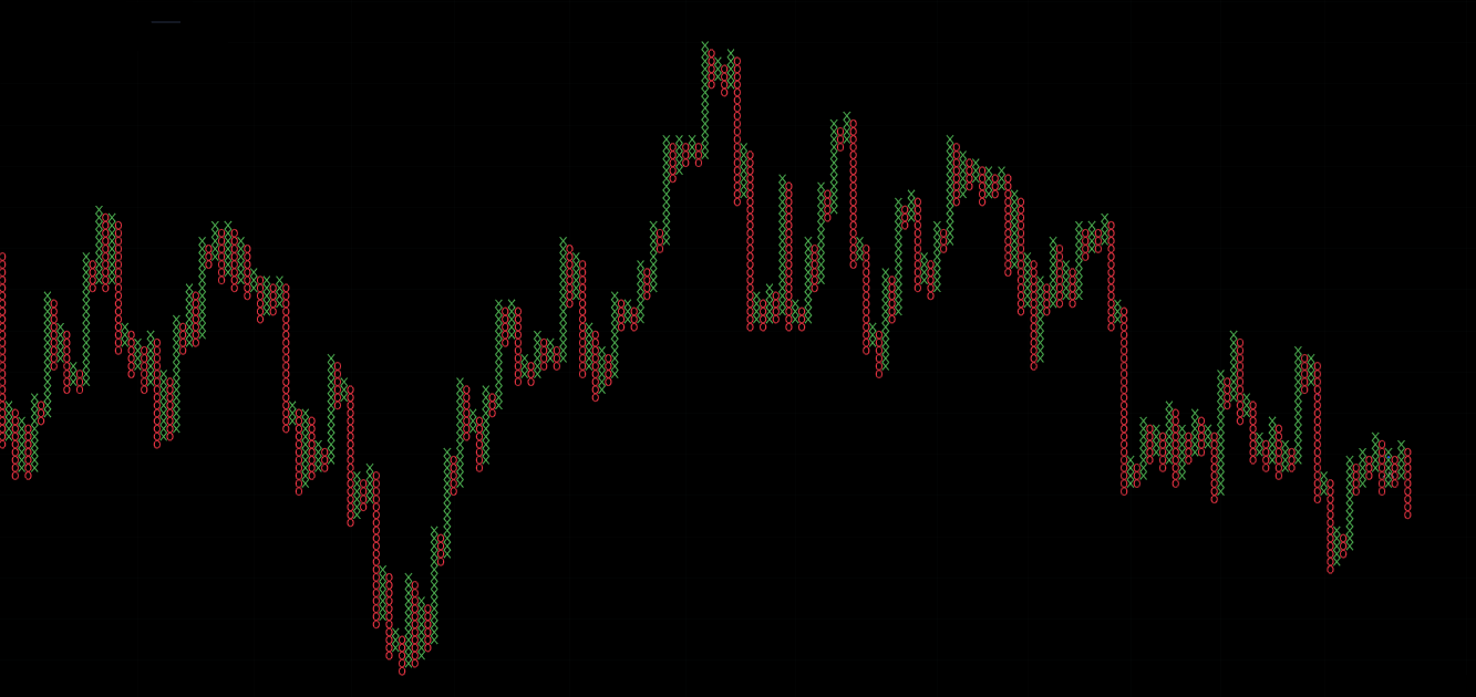
In order to change from X to O or vice versa, the value of the multiple (reversal amount) of the field by which the price must change must also be determined. Thus, if the value is 3, the price must change by three times that which results in the creation of the new field. Proponents of this view consider the biggest advantage of this view to be the ability to better define supports and resistances, and filter out false breakouts.
Kagi chart
The last chart we will briefly introduce today is the Kagi Chart, which, like the Heiken Ashi or candles, originated in Japan. It takes the form of connected vertical lines that changed in thickness in the original version of the chart, but today's more modern display allows the colour to change instead of changing thickness. The colour changes if the price crosses the minimum (to red) or maximum (to green) of the previous bar, or local swing.

The direction changes if the price movement changes by a predetermined amount, similar to the Point & Figure chart. Likewise, it can be a predetermined amount, percentage, or ATR. The biggest advantage of the Kagi chart is its ability to filter out noise in the markets, highlight strong trends, or signal overbought or oversold markets.
About FTMO
FTMO has developed a two-step evaluation process to find trading talents. Upon successful completion, you may be eligible for an FTMO Rewards Account with a balance of up to $200,000 in simulated funds. How does it work?


