


Price Action Trading: The COMPLETE Course for 2021
There are so many different trading strategies traders can utilize in their endeavours to be a successful trader. Price Action trading is probably the most popular trading approach among technical traders. But what really is trading a Price Action? Support and Resistance, Trendlines, Candlestick patterns, Fibonacci Retracement or Chart patterns are the most popular price action techniques traders use. This is exactly what we are going to cover in this trading course.
What is Price Action Trading?
For most technical traders, we all start off on the hunt for a worthy system/strategy that can prove to be profitable through the test of time, and throughout varying market conditions.
When it comes to trading, there is no right or wrong strategy, but rather finding a strategy that works for you.
What a lot of traders we talk to have in common is that after trying to trade with indicators, they tend to simplify their trading approach a move to price action trading.
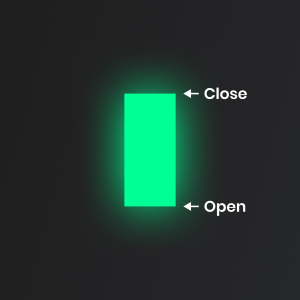
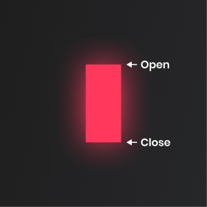
Price action trading simply means tracking prices’ movements.
Studying its recent and past movements, highs, lows, and information on all different time frames, in order to better analyze the price in current time and configure a plan for its future movements.
The term "naked trading" means keeping your charts clean, free of indicators.
The most important tools to use and things to pay attention to when it comes to price action trading are support and resistance levels, trendlines, candlesticks, chart patterns and Fibonacci levels.
Breakout and Reversal Price Action Trading
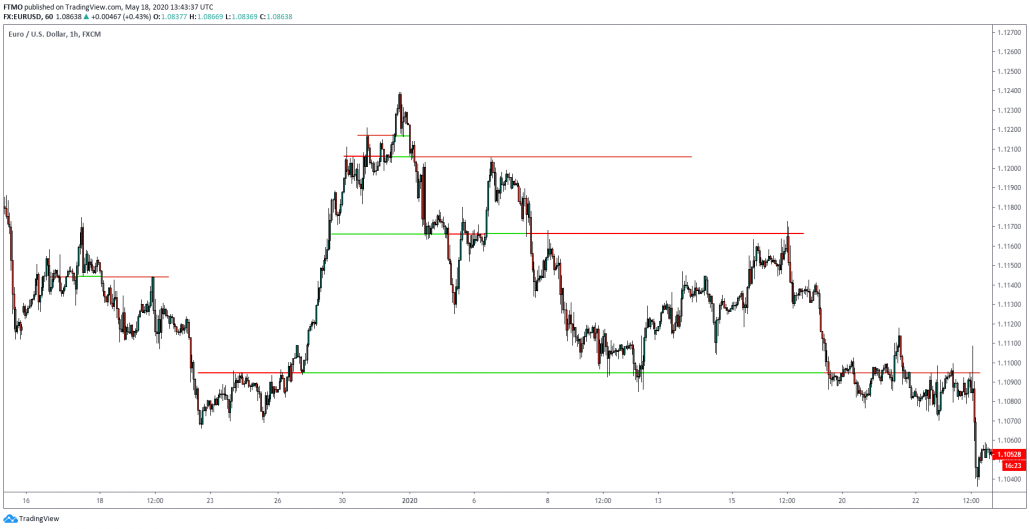
In June 2013, price on Gold fell to about $1200 after a severe downtrend. Price on Gold has never been that low since August 2008. Shortly after, price reversed and rallied up to $1430. 3 months later, we tested the $1200 level again in December 2013 and the price bounced again. Price hasn't tested that level until another 10 months later in December 2014.
It is not a coincidence that we see the price coming and reversing at a price level over and over again. It is very simple logic. When the price drops to a level and reverses, it marks a reversal level on a chart. This is to be interpreted as buyers coming into the market and overpowering the sellers, driving prices up. The second time price drops to that level, traders have to ask themselves: 'Buyers have come into the market at $1200 on Gold. Where is a logical price level to enter? Obviously, 3 months ago (first reversal) buyers did not allow the price of Gold drop below $1200, so there should be traders waiting at $1200 again to go long, right?' This thought proved to be right and price reversed off from our $1200 price level again... And again in December 2013.
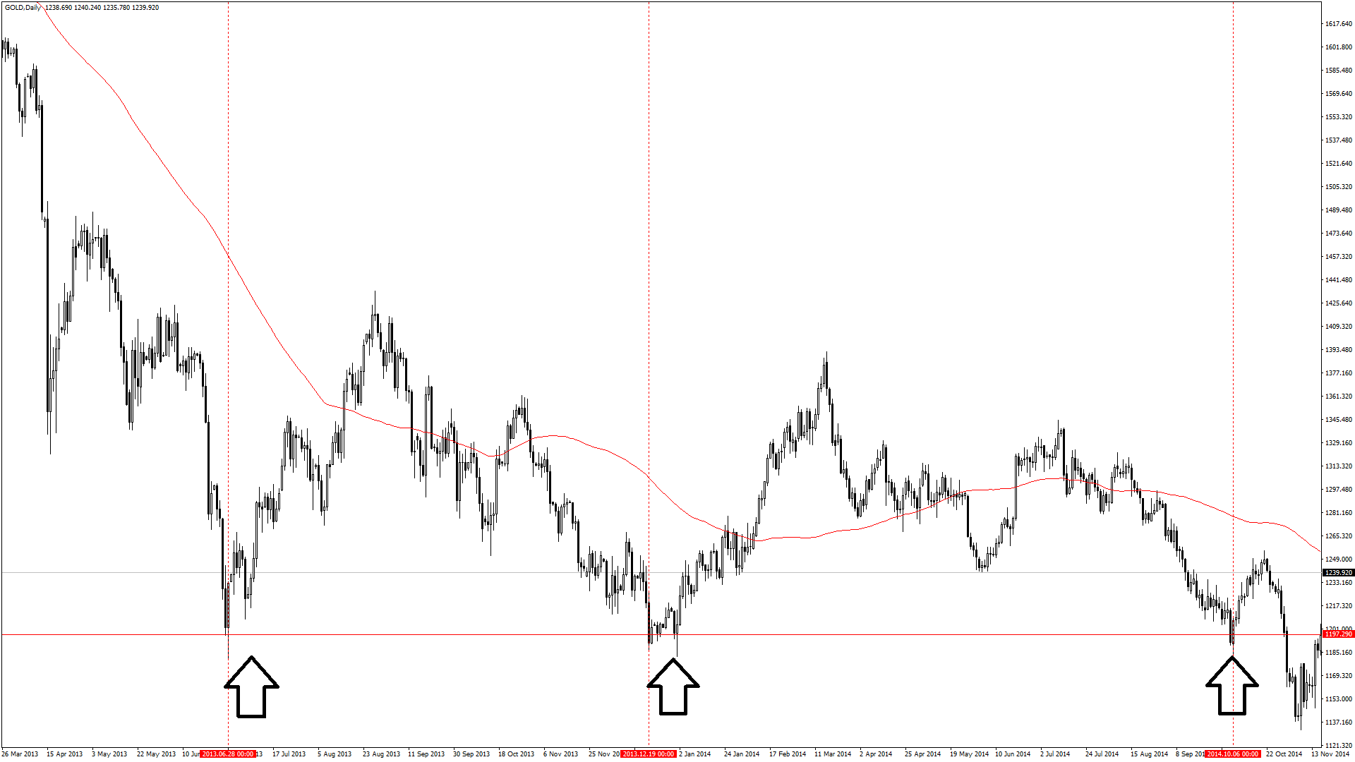
Gold - Daily
The graphical representation of this reversal level is the horizontal line drawn on the chart. Traders like to refer to it as Support, a price level where we can expect demand. On the other hand, we also have levels of supply, which traders refer to as Resistance. You can see a nice example of resistance below.
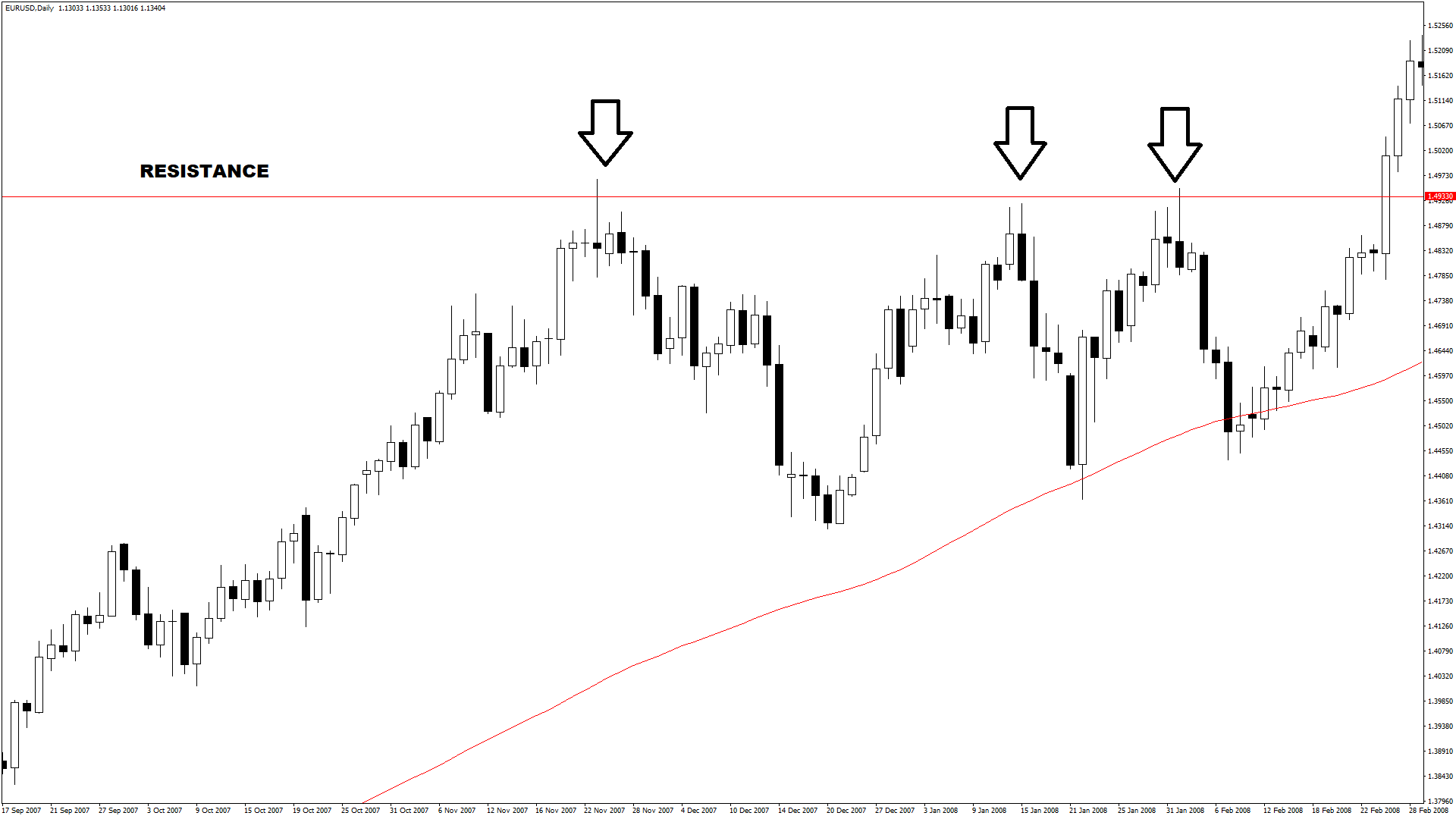
EURUSD - Daily
This was an introduction to a very popular trading methodology: PRICE ACTION. Price action strategies are very popular among many traders as it has a very simple and logical reasoning behind it. Price Action Traders are usually happy with a naked price chart. No indicators are required as the price is the purest information about an instrument.
The thought process of a Price Action trader is the following:
- Analyze past price movement to project demand & supply levels
- Capitalize on the projections by looking for trading opportunities
One method to project supply & demand levels are, but not limited to, Support & Resistance (S&R) zones, Trendlines, Fibonacci ratios or Highs & Lows (H&L). In this Article, I will present you a few simple trading strategies using only S&R levels and basic candlestick patterns.
Conventionally, Price Action Traders will fall into one of the two main categories:
- Reversal Trading
- Breakout Trading
Reversal Trading
Reversal traders project supply & demand levels and when the price hits these levels, they expect the price to reverse in their favour. In the following example, we will use candlestick patterns to confirm successful reversals.

BTCUSD - H1
The chart above is on the BTCUSD hourly. We can spot the first high after a bull run. The second high was then confirmed by a bearish Pin bar. Notice how the Pin bar doesn't exactly respect the previous high, however, what we want to see is some signs of reversal. Now we have two established highs and with these, we will construct our resistance level. The reversal trader now waits for the price to test this level again, which did happen a third time. Of course, we do not want to enter blindly into the third test. We require some kind of confirmation to distinguish a simple price spike from an actual breakout. On the chart, we see another bearish Pin bar that confirms our reversal idea and we put a sell order below the bearish Pin bar.
Nevertheless, an idea for entry is not enough. A trader is required to have a solid trading plan, knowing when to get out. His idea will be proved wrong if price breaks the high of the Pin bar after the entry. In such a case, the Pin bar would be a false signal and our resistance level would have failed. If our idea is proven to be right, we will be looking for a probable Take-Profit level. The previous low is a good demand level, as traders decided to push the price up there. In other words, we expect buyers not pushing the price higher, not before testing the previous low as shown in the chart.
This trade setup has a very good RRR and we see, that the previous low was almost ignored. Nonetheless, our Take-Profit has a clearly defined logic and we should not change our trading plan based on one single trade.
Breakout Trading
Breakout traders expect S&R levels to fail. According to our previous explanation in the previous article, Support is a level of high demand and Resistance is a high level of supply. But what if these levels fail?
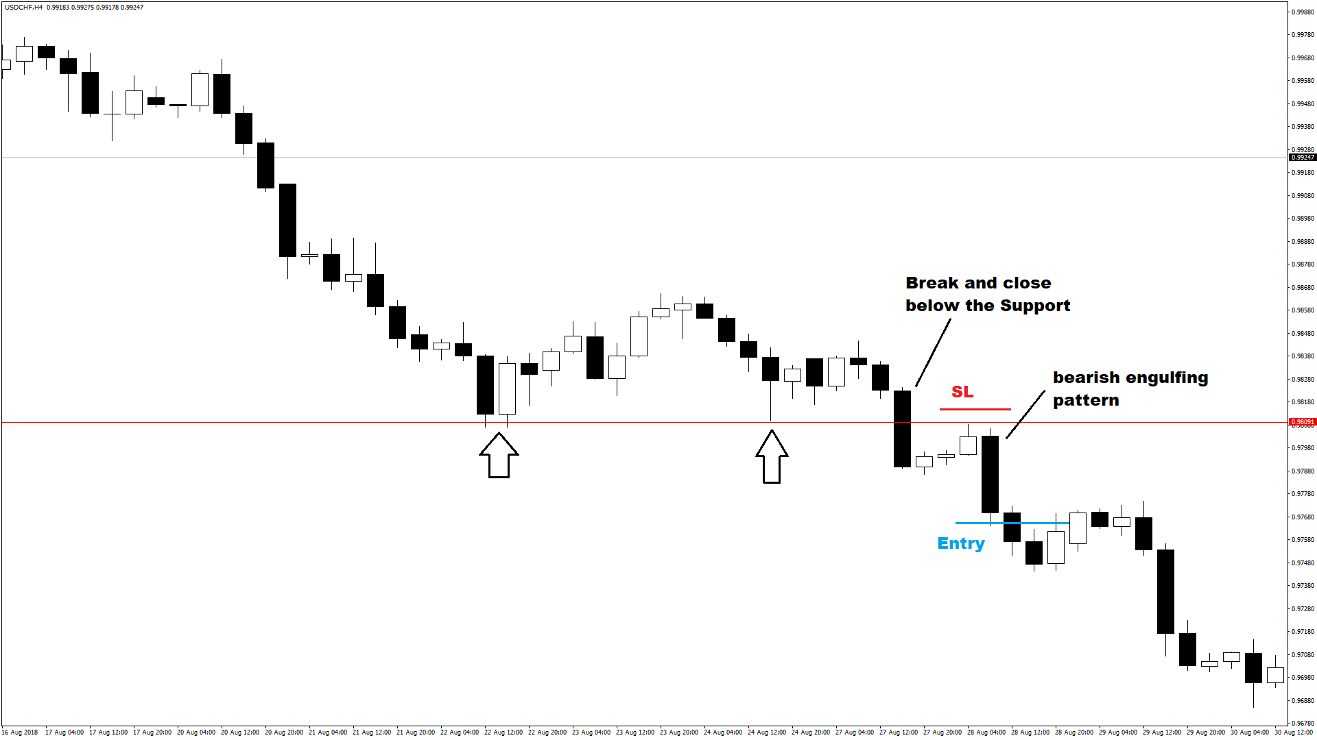
USDCHF_H4 Chart
In this example, we are on the USDCHF 4-hourly. The price made two lows, establishing a support level. On the third test, we saw a bearish candle closing below our support. This is the first signal that the support level has failed and that the price might want to head lower. However, in order to increase our chances of success, traders often wait for a retest of the broken support. We can see the retest after the breakout on the chart. When price touched the broken support, it printed a bearish engulfing candlestick pattern. This is our confirmation for the breakout and we would enter at the low of this pattern. Stop-Loss is then set above highs of this pattern. This is a very good entry and Stop-Loss placement.
However, now we have a problem. In order to set our Profit Target, we would have to look for the next support level. However, there are no data on the higher timeframes to find such levels. As an alternative, we can use another tool to project our demand levels, the Fibonacci extension tool.
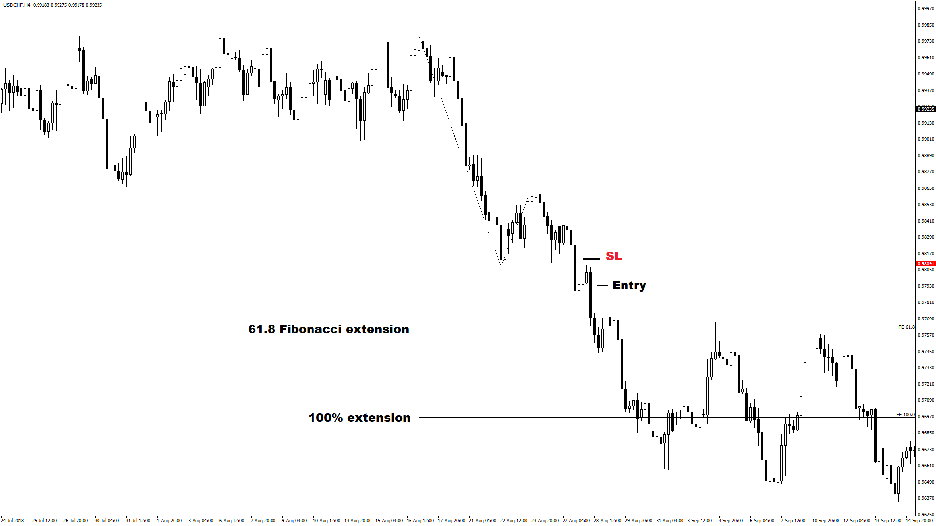
USDCHF_H4 Chart
Here we see our trade in the bigger picture. On the left side, there is no price action, therefore, we cannot draw any S&R levels. By using the extension tool in our MT4 platform, we connected the start of the previous impulse with the end of the previous impulse, back to our retracement level. On the chart, you see lines projected and we now have two options to exit our trades. You may choose to exit at the 61.8% extension or the 100% extension. There is no right or wrong in trading. Some traders like big wins, others like a lot of wins.
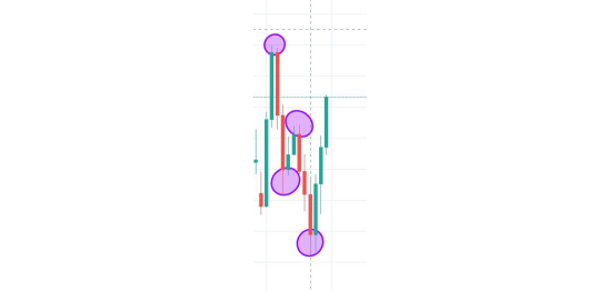
Candlestick Patterns
Candlestick patterns are one of the most common price action techniques.
There are literally hundreds of different candlestick patterns you can find online.
Do you need to know all of them? Of course not.
We have picked the most common and important ones you should know.
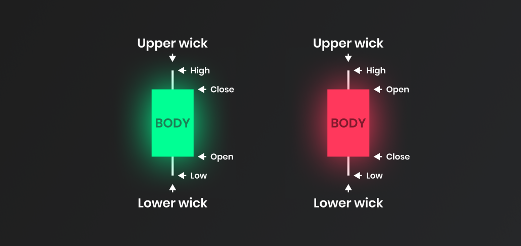
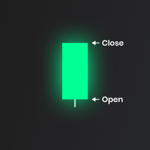
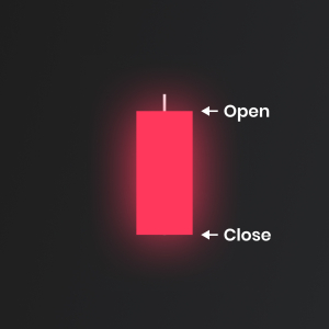
They are easily spotted on Japanese candlestick charts.
What are Japanese Candlesticks?
Japanese Candlesticks belong to the most popular methods of technical analysis.
Searching for specific candlestick patterns was first used in the 16th century in Japan at the rice exchange.
These were the very beginnings of technical trading.
The Benefits of using Candlestick Patterns while trading Price Action
Among the greatest advantages of candlestick patterns are their simplicity and informational value.
After a brief familiarization, the trader can quickly analyze market developments and determine what is happening in the market.
Are buyers stronger than sellers, or vice versa? Can we expect the trend to cease, or on the contrary, could it gain in strength again?
In fact, candlestick patterns can reveal the psychology of traders.
Various candlestick shapes can suggest whether it is buyers or sellers who are stronger. A typical example can be seen on the graph below.
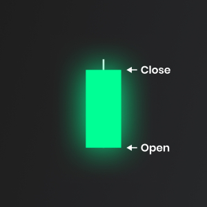
Long Day Bullish Candlestick Pattern
Starting with the easiest one, Long Day Bullish Candlestick.
Long Day Bullish Candlestick consists of just one candle with a long body and short wicks.
This candlestick usually shows strength and it can be used as a "breakout" candle at the beginning of a trend.
Traders don't use Long Day Bullish Candlestick as entry or exit signals, but more as a confluence with their ideas.
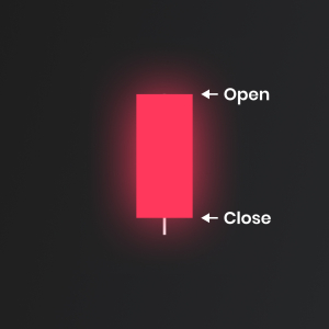
Long Day Bearish Candlestick Pattern

Long Day Bearish candlestick is represented by a big sell candle body and small wicks.
It signals a weakness in the market and the fact we should start looking for the possible start of a downtrend.
Long Day Candlesticks are simple. They can give you clues what might happen next, but as we mentioned before, they should not be used as entry and exit signals alone.
Short Bullish Day Candlestick Pattern

The short bullish day candlestick is an easy to spot pattern. It consists of one candlestick.
Short day candlestick is defined by its length.
How short the candle must be? This is not 100% defined, so you should always use your discretion and review past trading periods to have a comparison.
Short day candlestick is not used as an entry/exit signal.
Short day candlestick pattern signals the fact that price stayed in the range during a trading period and we can expect an expansion soon.
They can be found in the larger patterns providing relevance.
Short Bearish Day Candlestick Pattern

This is the opposite of a Short bullish day candlestick.
Same as his bullish colleague, this candle is common but not so worthy on its own.
You should always wait to spot it in a larger context and think about what are buyers or sellers trying to achieve in current market conditions.
Bullish Marubozu Candlestick Pattern
Very simple and powerful candlestick pattern is called Marubozu.
Spotting Marubozu candlestick is one of the easiest things you can do.
It signals with a real long body without an upper or lower wick.
Bullish Marubozu candlestick shows us one pretty obvious thing, the buyers stepping in the market.
There are two situations where you can make a trading decision with bullish Marubozu candlestick:
- If you spot bullish Marubozu in an uptrend, trend continuation is likely.
- If a bullish Marubozu occurs in the downtrend, reversal is likely to happen.
Bearish Marubozu Candlestick Pattern
Bearish Marubozu has the same two uses as bullish one, they are just reversed.
- If bearish Marubozu happens in a downtrend, the trend is likely to continue.
- If bearish Marubozu occurs in the uptrend, reversal is likely to happen.
The smart thing to do after you see a Marubozu candle is to wait for further confirmation in term of another candlestick patterns, support and resistance or indicators.
Bullish Closing Marubozu Candlestick Pattern
There is only one small difference from a bullish Marubozu and that is a lower wick.
This candlestick suggests that we had some sellers trying to step in after candle open but buyers were much stronger and closed higher.
If Bullish Closing Marubozu appears in an uptrend, it gives us a signal of continuation.
Another great location of Bullish Closing Marubozo is at key support area where we can expect the price to rise higher.
Bearish Closing Marubozu Candlestick Pattern
Bearish Closing Marubozu is a bearish candlestick pattern which is signalled with small upper wick and big bearish body.
There are 2 locations where you should be watching for Bearish Closing Marubozu.
In a downtrend, this signals that trend is likely to continue and at key resistance level where we can expect a new move down to begin.
Bullish Opening Marubozu Candlestick Pattern
Even though Bullish Opening Marubozu has a small upside wick, it is a very bullish signal in the market.
It shows the fact that buyers took control straight from the open and even though they met some sellers at the top, the bullish bias prevails.
Bearish Opening Marubozu Candlestick Pattern
Bearish Opening Marubozu signals strong conviction from sellers in the market.
Although there is a small lower wick, you can notice a price rally right after the candle open.
Bearish Opening Marubozu in a downtrend signals continuation, in an uptrend it can signal a possible trend reversal.
The Spinning Top Candlestick Pattern

The Spinning Top candlestick pattern is a neutral candlestick. By neutral we mean the fact that is doesn't matter that much if the candlestick closes bullish or bearish, the important factor is the candlestick closing location.
The Spinning Top candlestick pattern has a single candle with a small body and a long wicks.
It signals indecision in the market, the general rule of thumb is that if we see the Spinning Top Candlestick at resistance level, its a short reversal signal.
Vice versa, spotting the spinning top candlestick at support area signals long reversal.
The Doji Candlestick Pattern

Similar to the spinning top candlestick, Doji is an indecision candlestick pattern.
You can recognize a Doji candle by a very small body and short wicks on both sides.
A Doji is often found at the tops and bottoms of trends so it is considered as a sign of possible reversal of the movement. That being said, more complex Doji patterns can be also used in trend continuation.
Although Doji is an indecision candlestick pattern, there are three different variations which are going to help us make more educated trading decisions, there are Long-legged Doji, Gravestone Doji, Dragonfly Doji.
Long-legged Doji Candlestick Pattern

A long-legged Doji is very similar to the spinning top candlestick.
Compared to regular Doji, it is a much more dramatic candle with long upper and lower wicks.
Long-legged Doji is the same as the Spinning top candlestick, it signals indecision in the market and a possible reversal in play.
Gravestone Doji Candlestick Pattern

Gravestone Doji is a bearish candlestick pattern.
It shows us a fact that buyers tried to step in, but sellers strongly overcame them and pushed the price back to open.
In an uptrend, Gravestone Doji gives us an indication that the market is ready to turn around.
In a downtrend, we can use a Gravestone Doji as our continuation signal.
Dragonfly Doji Candlestick Pattern

Dragonfly Doji is a bullish candlestick pattern.
It shows us a fact that sellers tried to step in, but buyers strongly overcame them and pushed the price back to open.
In a downtrend, Dragonfly Doji gives us an indication that the market is ready to turn around.
In an uptrend, we can use Dragonfly Doji as our continuation signal.
Bullish Engulfing Candlestick Pattern
A bullish engulfing is the first 2 candlestick pattern we have.
It forms with a small red candle on the left and big green candle on the right.
The big green candle on the right has to completely overlap/engulf the candle on the left.
The rule is - Bullish engulfing candle has to trade below the low of the previous candle and has to close above the highest point.
Bearish Engulfing Candlestick Pattern
Bearish Engulfing forms with small green candle on the left and big red candle on the right.
The big red candle on the right has to completely overlap/engulf the candle on the left.
The rule is - Bearish engulfing candle has to trade above the high of the previous candle and has to close below the lowest point.
Trading Support and Resistance
Support and resistance zones can be compared to a floor and a ceiling for price, with support being the floor, and resistance being the ceiling.
It is typically common for price to have a harder time breaking through these zones, which is why it is important to mark up and pay attention to these zones to use as a confluence among other confirmations for trade set-ups, as the price has to either break through or reject a zone.
Support and resistance zones are typically stronger on higher time frames, but are still useful on smaller time frames, so it is important to identify zones on multiple time frames.
Supports and resistances sometimes work so nicely and sometimes they don’t work at all.
So many traders wonder: “Are they really so important as one says? Why everyone wants to use them if they are not 100% sure? Why they are not always so powerful as expected?
The first thing to say is they are not a complete trading strategy to use.
They cannot be used blindly in every circumstance and without confirmations.
Because of that, we want to give a good tip and shortcut to identify only best levels avoiding being lost with tons of lines and try to add more odds in our favour when we want to enter into a trade.
How to identify support and resistance levels?
Supports and Resistances are like walls, something that the current price has difficult on breaking it through. If the wall is above the current price, we have a Resistance, otherwise, if the wall is below the current price then we have a Support.
Many people like to paint charts with tons of levels here and there and then they find an excuse to use these levels to justify their blind entries and no matter if they were not correct or they had no sense.
The truth is not all levels are equals and not all levels can work properly and fine.
In order to add odds in our favour, we need to understand and identify only those levels which can perform well in the direction we want and don’t consider all other levels.
First of all, we need to have in our mind the overall direction and identify those areas which could be used as an entry point to trade in the direction of the overall flow.
Many people say “the trend is your friend” and actually it’s true, so why don’t use it in our favour?
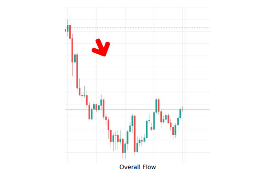
In the previous image, the overall flow is a downtrend, so our job is to identify good S&Rs to operate in the direction of the downtrend. It means we have to identify only those levels that could work as Support.
Supports can be created in two conditions:
- When the price breaks through a low point, a Resistance is violated.
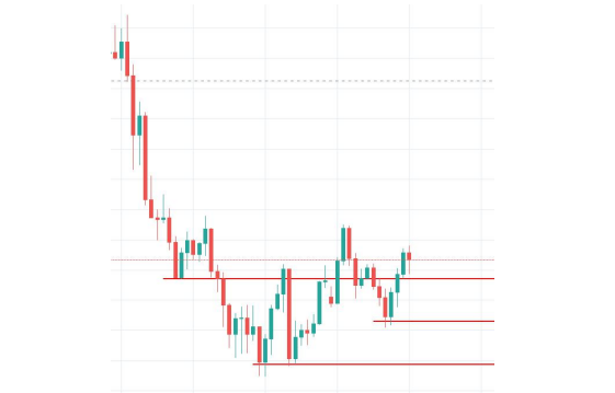
- If we draw all possible Supports (red lines), we have something like this:
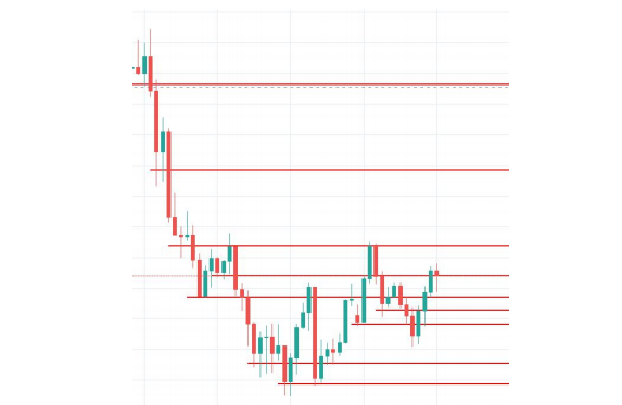
But if we consider only those levels that not only stop the down movement but they actually turn it around for a bit creating a kind of higher high and higher lows, then we have only these levels:
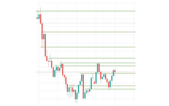
The same thing is valid for Supports. If we want to draw all possible levels (green lines) we have:
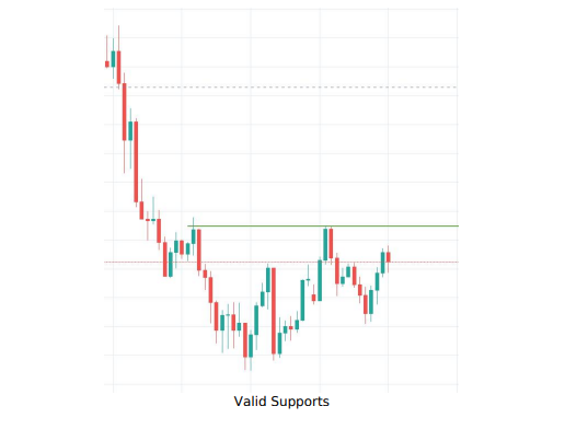
But if we consider only those levels that have enough power to break through the valid Resistance identified previously, we have only these levels:
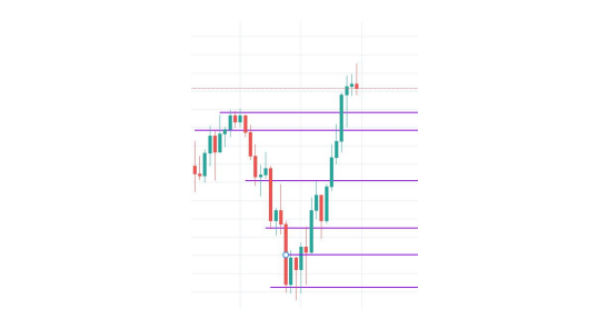
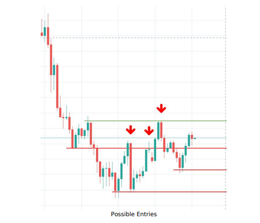
If we combine valid Supports and valid Resistances, we have good spots where to enter into a trade:
The four popular ways of drawing a Support and Resistance levels
Price Action
Price action is one of the most popular trading approaches when it comes to support and resistance.
You will find a lot of traders who only use price charts in their decision making.
So how would they draw support and resistance levels? Well, there is not a right or wrong approach, you can use both wick or bodies of the candles when making your S/R level.
The general rule of thumb is that markets have memory, that's why it is not a bad idea to use levels which played significantly well in the past, increasing the likelihood they might do so again in the future.
Supply and Demand
Contrary to classical support and resistance levels, some traders prefer to look for supply and demand areas on their charts.
These areas are generally zones where you can spot aggressive participation based on supply and demand dynamics.
If you have a strong move up, it means that demand overcomes supply, i.e., buyers were more aggressive than sellers. Once this zone is revisited, we can expect renewed buying at the zone.
Of course, the same goes for selling.
Volume Profile
One of the less popular ways to find support and resistance areas is to use the volume profile. This method is often used among futures traders, but it works well in forex as well.
We have recently published a series of videos and articles about using volume profile, market profile, and auction market theory in your trading. You can find it right here.
To explain briefly, the price often uses High Volume Nodes (HVNs) as support and resistance levels, especially when there is also a POC (point of control). Compared to price action and supply and demand, the volume profile has the advantage of being less subjective, giving you exact levels to buy and sell.
You can also use Low volume nodes (LVNs) and other HVNs as your targets.
Pivot Points
Last on our list are Pivot points, and these are the least subjective from the list.
And even though some traders have strict anti-indicator approach in their trading, Pivot Points are trendy even among professional traders.
Trend Lines
Trend lines hold a lot of significance as well because the basically serve as a diagonal support/resistance.
A rule of thumb is that if you can put a diagonal line below price where it has a least two touches of the line without breaking, it is in an uptrend, and vice versa for a downtrend.
The more touches price has on one of these trend lines, the stronger the trend line is.
Now to tie these two together, imagine you are trading a pair which has been selling off heavily for the past several days, and it is approaching a support zone where it has bounced off of twice, and it would also be the third of the trend line you drew.
This would be a great zone to watch and see how price reacts when it touches it, for a possible long set up.
The touches on the trendline should be spread out along the trendline instead of clustereted at one place.
General rule of thumb is the the longer the trendline, the more significance it holds.
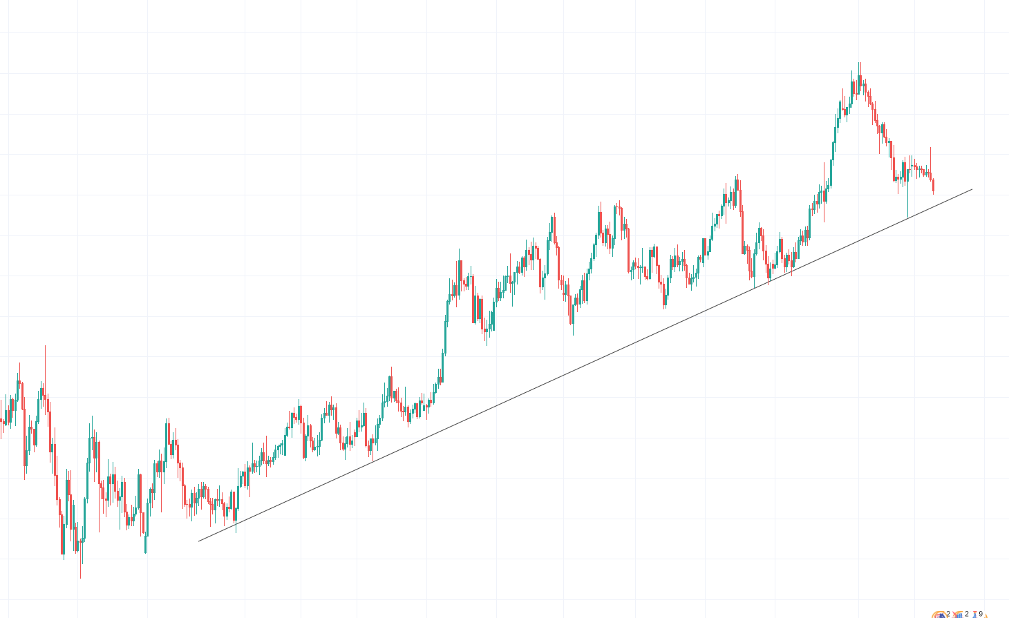
Chart Patterns
Now as we have covered horizontal and diagontal support and resitance.
We can have a look at chart patterns as they are combination of both.
Chart patterns are one of the oldest parts of technical analysis and price action trading.
They were proven many times as a functional way to help technical traders identify the next market direction.
That being said, a trader should not forget about the context and current market conditions while making decisions in trading.
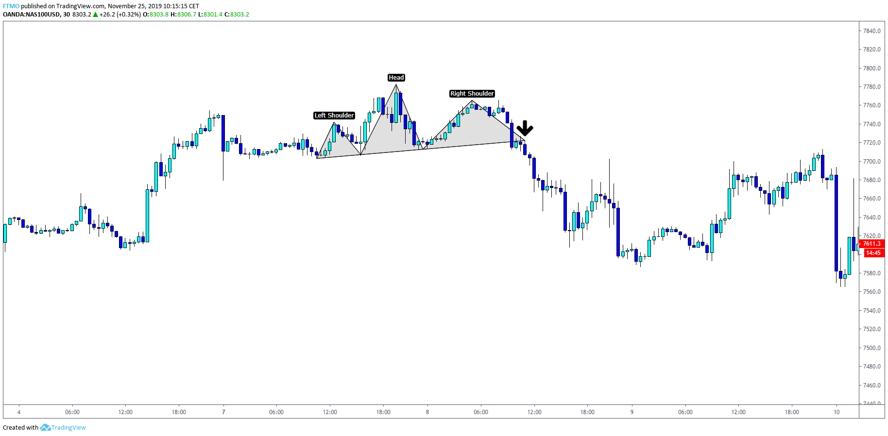
Head and Shoulders Pattern
Head and shoulders pattern is believed to be one of the most reliable reversal patterns. It starts after a long bullish trend when the price rises to the peak and pulls back. Shortly after, the price rises again to a significantly higher peak but declines again. Finally, the price goes up for the third time but only reaches a level of the first high. After that, it pulls back and completes the pattern which signals that an uptrend is ending and the price is about to decline.
The first and third peaks are the shoulders and the second peak is the head. The support level where the price bounces from is called a neckline and is often used as entry-level on a break.
Inverse Head and Shoulders Pattern
As with other patterns, there is also an inverse head and shoulders which occurs after an extended downtrend and indicates that price will go up.
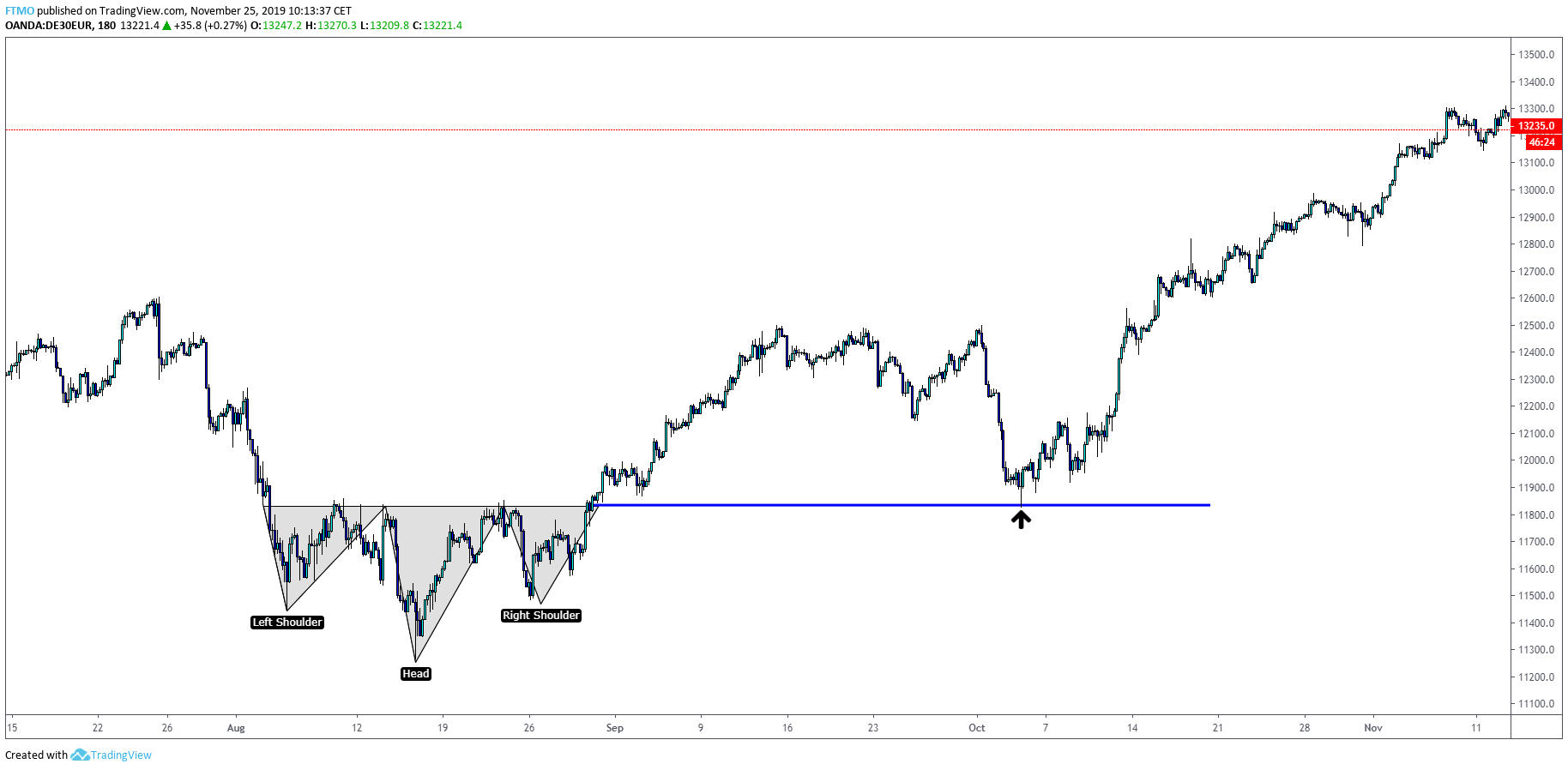
You can notice on both charts that breaking off a neckline would give us a great trading opportunity.
In the second case, you could even use a neckline retest as a second entry.
Cup And Handle Patterns
A cup and handle pattern is a bullish continuation pattern. It consists of two parts - a cup and the handle. Once a cup is completed, the handle is formed at the right side of it. If it is followed by a breakout on a resistance line and traders consider it a signal for an uptrend.
The pattern can only be recognized on the long term charts because of longer time requirement of forming a pattern.
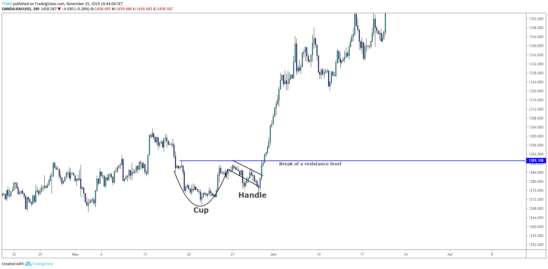
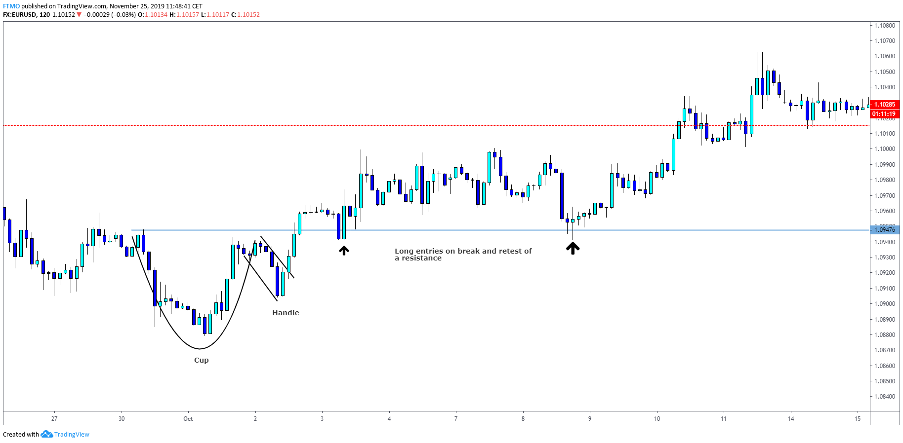
As you can see, identifying and trading a 'Cup and Handle' pattern is nothing complicated. Once you enter the trade on a retest of resistance, you can place your stop loss below the low of a handle and let the trade do its work.
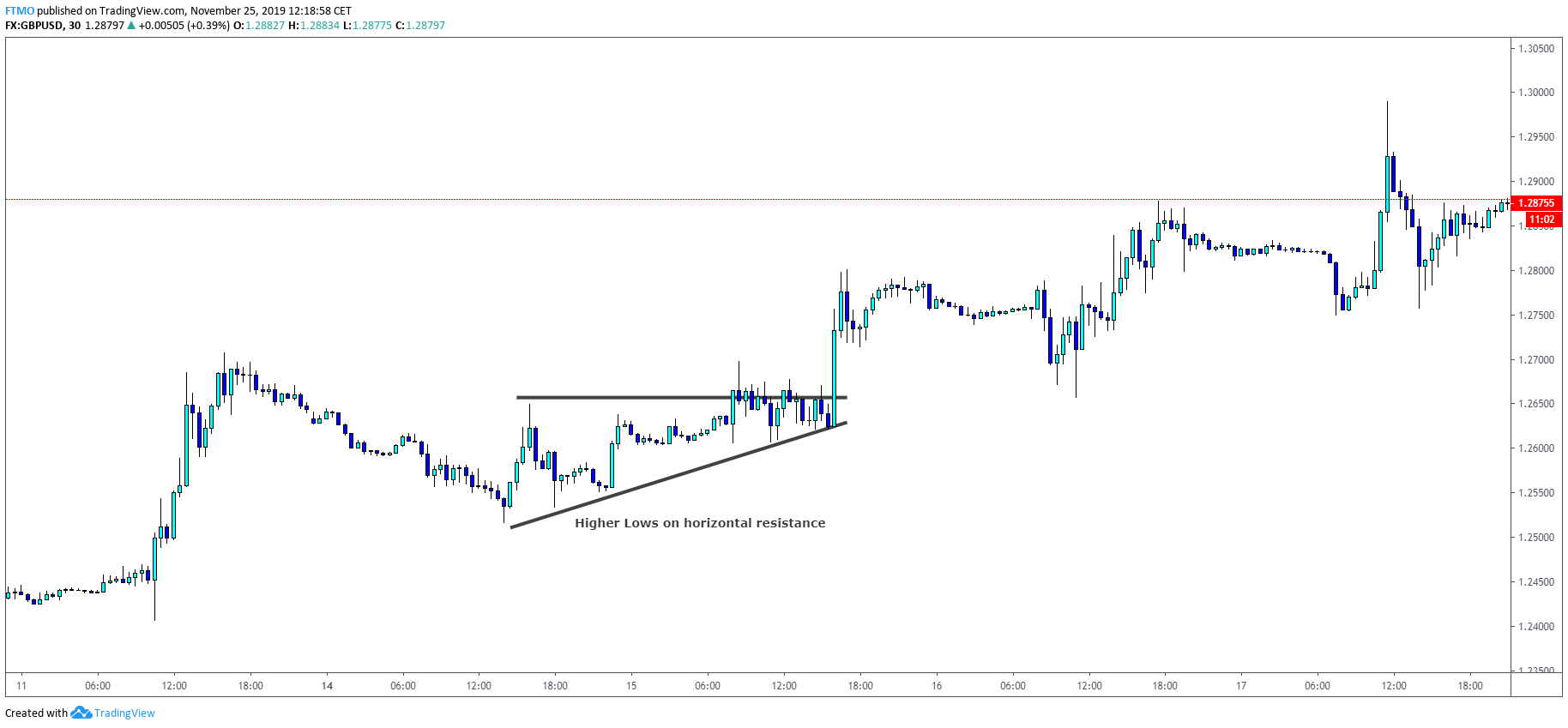
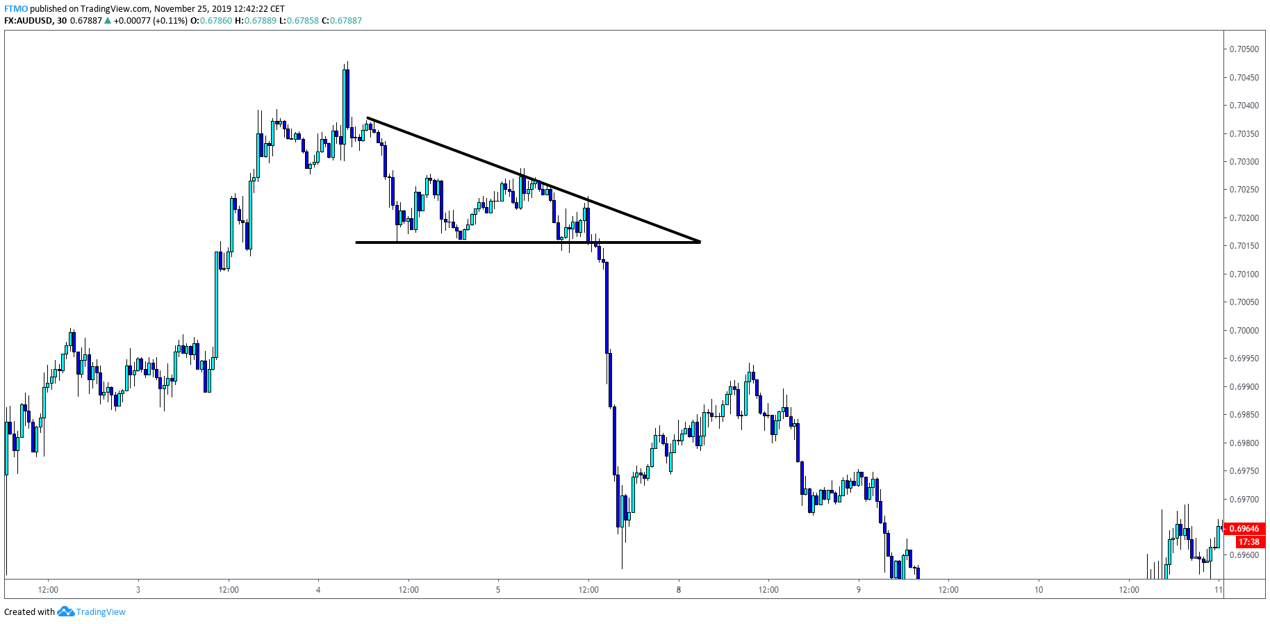
Ascending Triangle
Both ascending and descending triangles are one of the most popular patterns among traders. To really help you understand this pattern, we should take a look at it from more of a logical perspective.
The ascending triangle is formed when the price is unable to break a resistance but at the same time, it is forming higher lows.
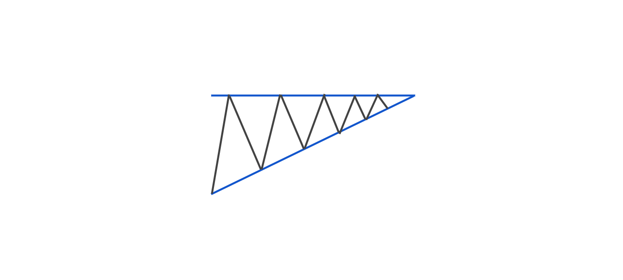
As you may notice on the example above, the price is bouncing from resistance but is unable to make a lower low on each bounce. This is giving us a bullish signal that a possible break is about to happen.
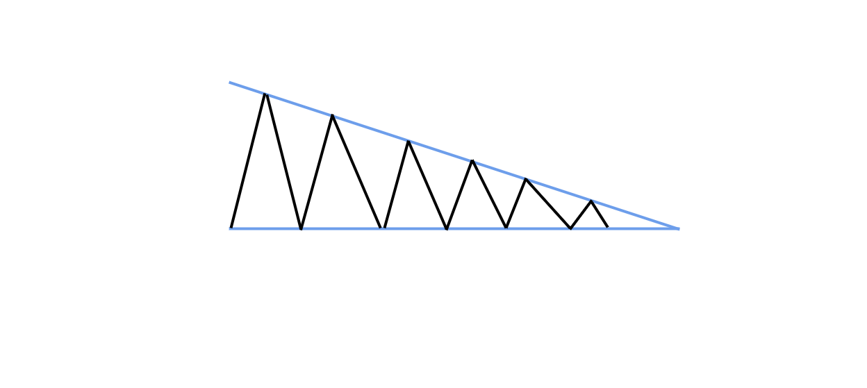
Descending Triangle
Inverse to the Ascending Triangle, the Descending Triangle is visible when the market is bouncing from support but it is unable to make higher highs.
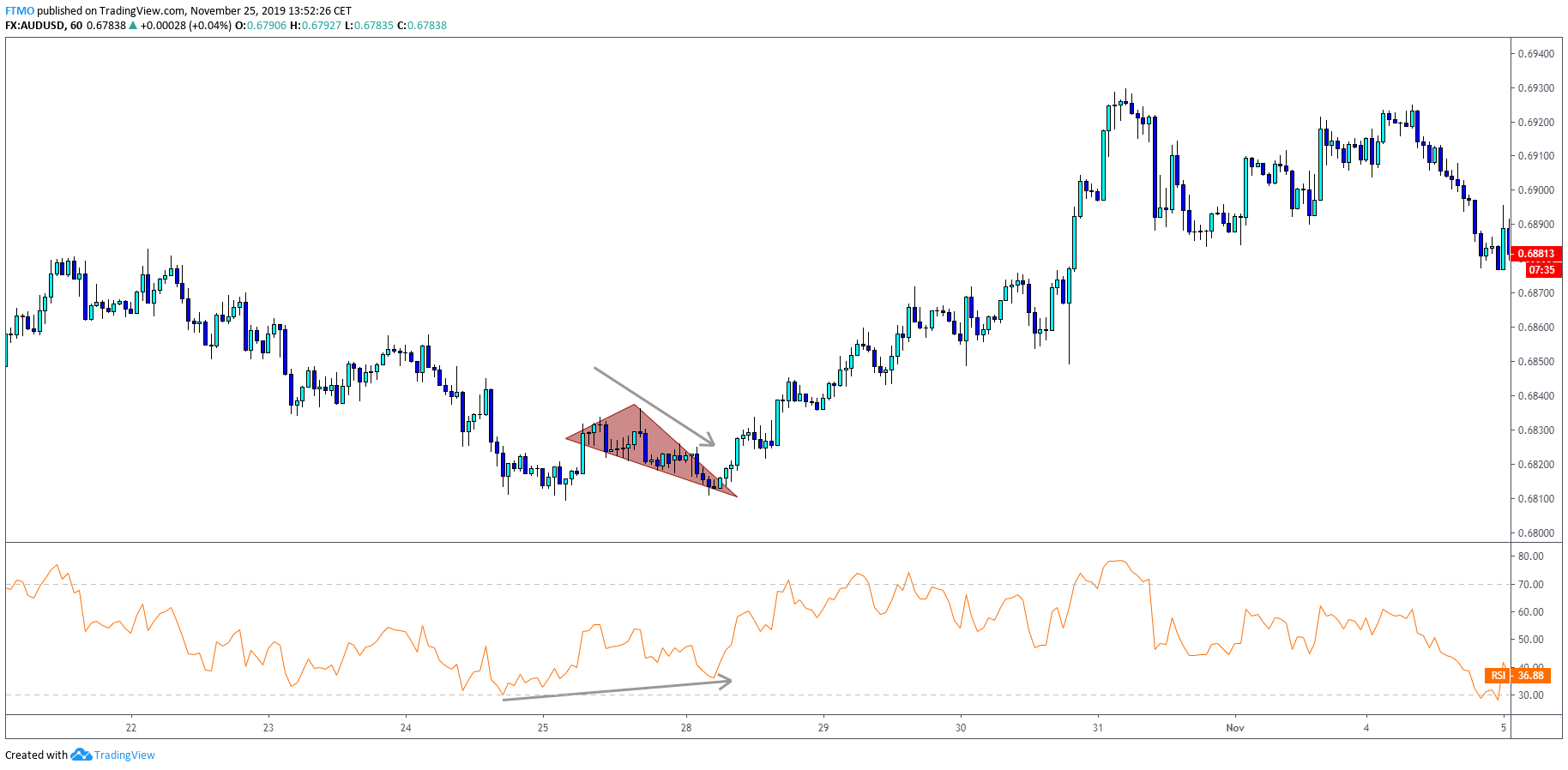
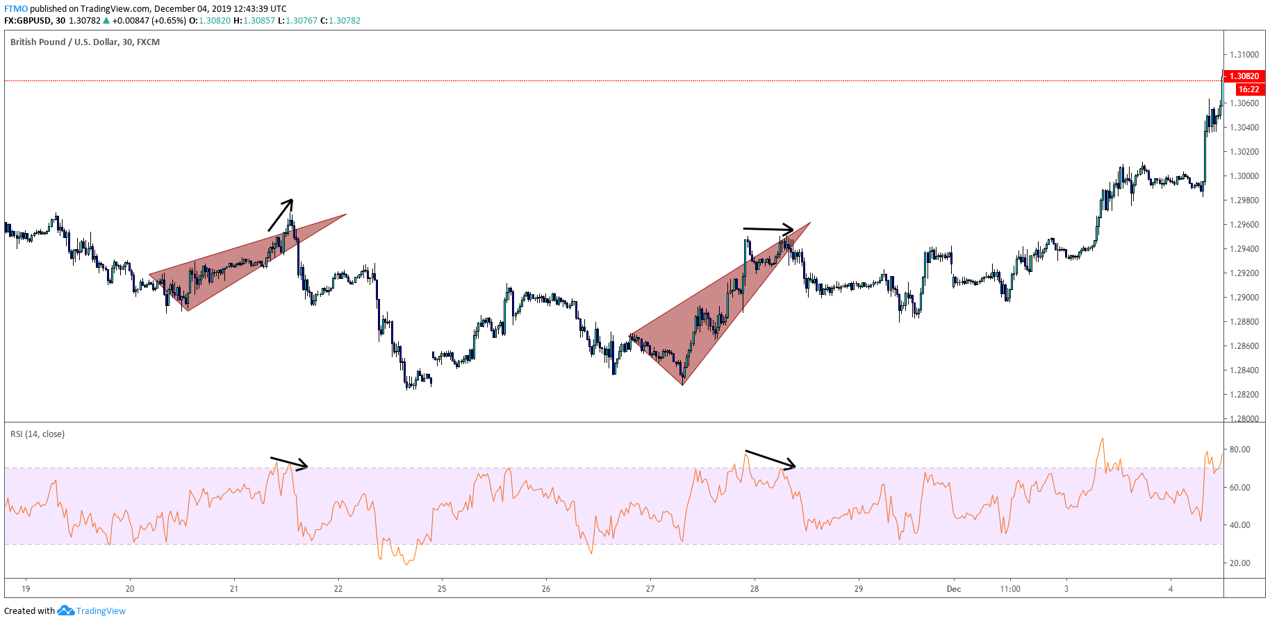
Falling Wedge
Falling wedge is a bullish reversal pattern which happens most of the time when the price is pushing lower but we can see divergence at one of our oscillators.
This means that even the price is going lower, sellers are getting exhausted and we can expect a reversal to happen soon.
Rising Wedge
Reversal of Falling Wedge, price is pushing higher but you can find weakening clues in your oscillator.
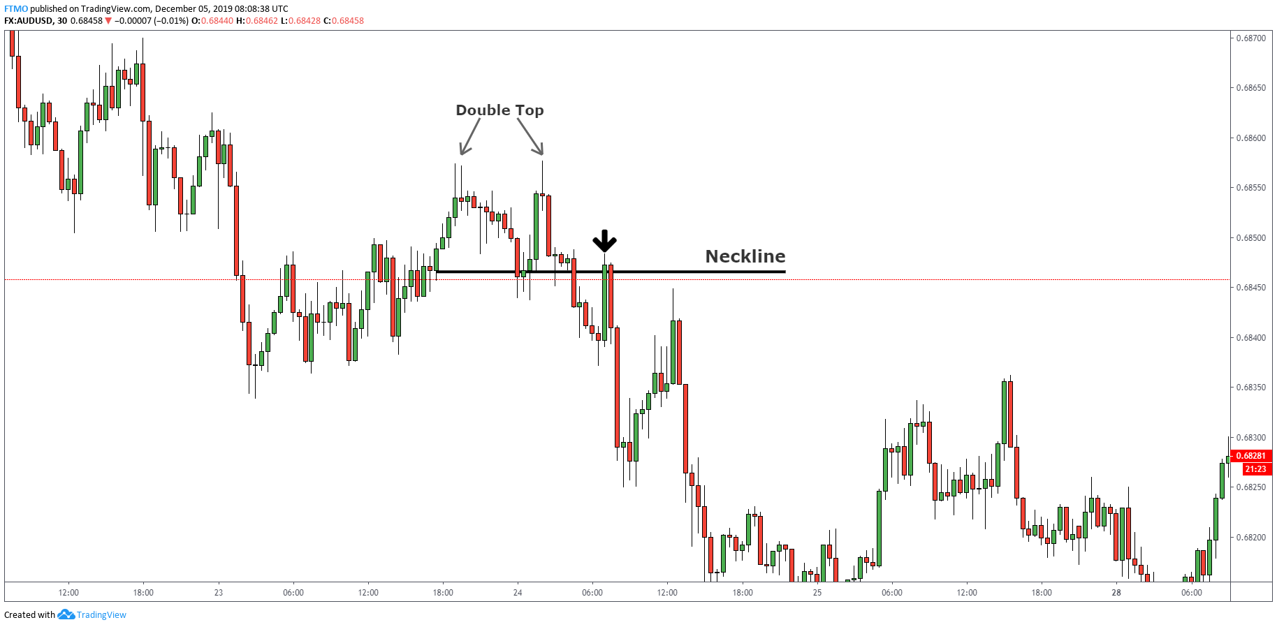
Double Top Pattern
The double top pattern is usually made as a topping formation at the end of the trends. It is a bearish reversal pattern which is characterized by the peak which is shortly followed by the second one at the same or very similar price point.
The double top pattern is valid once the price breaks the support made bellow the highs.
We use the same term "neckline" which is also used with the Head and Shoulders Pattern.
You can either enter the trade once the neckline is broken or wait for the retest of the neckline.
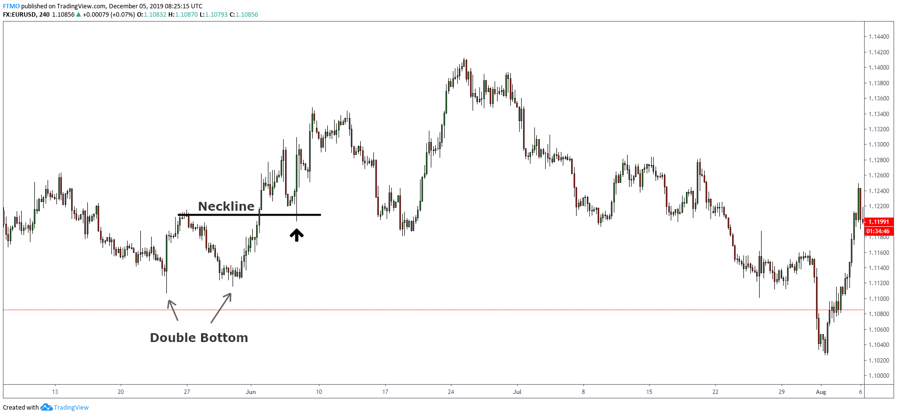
Double Bottom Pattern
The opposite of the Double Top is the Double Bottom pattern which is made at the bottom of the downtrend.
The Double Bottom is characterized as two bottoms at an equal or similar price level.
Same as with the Double Top pattern, you can enter either at the break of the "neckline" or its retest.
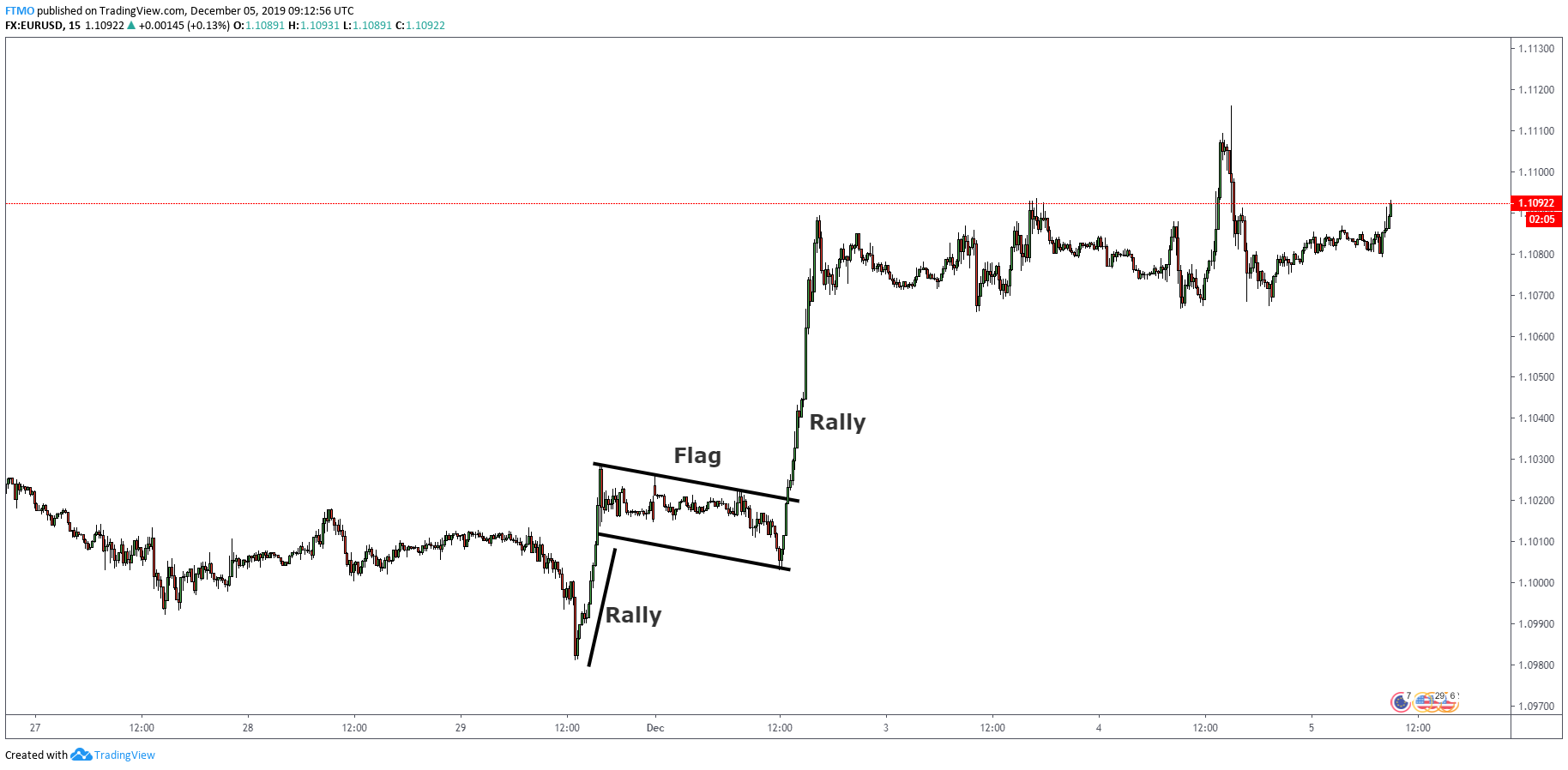
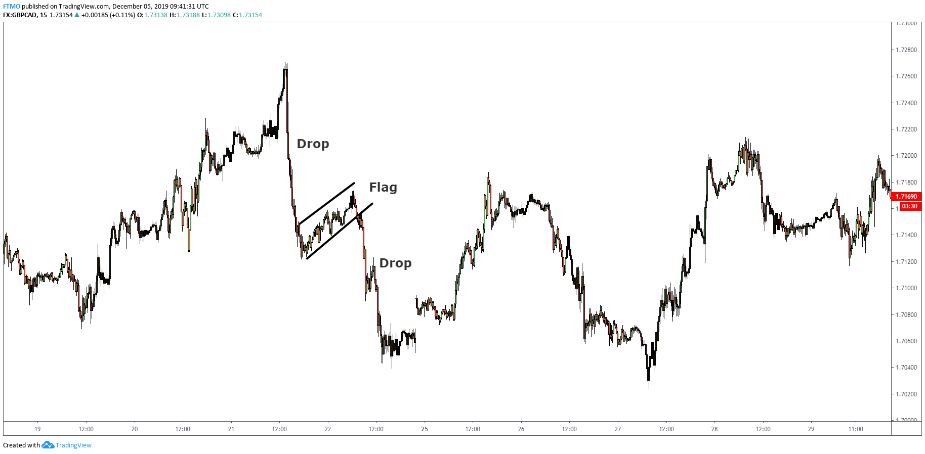
Flags
Flags are technical patterns which can be understood as a pause in the underlying trend.
Flags are spotted as consolidation after a fast trend in the market and they signal the continuation after the breakout.
As with all chart patterns, we have a Bull and Bear flag.
Bull Flag
Bear Flag
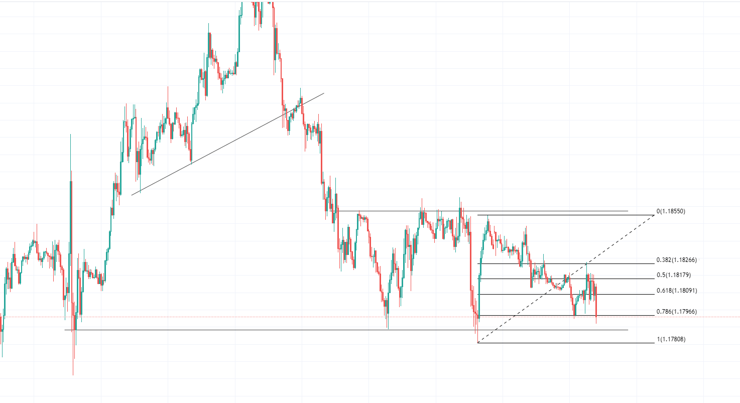
Fibonacci Retracement Tool
Fibonacci Tool is very popular among retail traders. Many traders say that there is a magic in Fibonacci numbers like .236, .382, .618 or .786. These numbers generally work because a lot of people are just watching them.
The market trends in waves made up of two components, impulse moves and correctional moves.
An impulse move is the strong initial move a pair makes, but since a pair can not move in one direction forever, at some point buyers or sellers will get exhausted and a pullback/correction must occur to give the market some balance.
The Fibonacci tool measures from the high to the low, or the low to the high of an impulse move, and shows you the different percentage levels where the price is likely to pull back.
To give an example of using the Fibonacci tool in confluence with you trading, imagine the price of a pair has an impulsive move, breaks an important resistance level and forms a high above it.
You then draw your Fibonacci from low to high and see that the resistance that it broke (now turned support) now sits at the 61.8 Fib level.
This would be a good confluence when thinking about taking a long position when seeing how price reacts if it pulls back to this level.
In Conclusion
When formulating a strategy or your trading system, it is important that you find something that works for you.
It may not work for someone else, but if it proves to be profitable for you, then it is all that matters.
As indicators lag behind the price, learning how to interpret and read the Price Action will allow you to see all the possibilities for the market’s next move and how you can anticipate that.
About FTMO
FTMO developed a 2-step Evaluation Process to find trading talents. Upon successful completion you can get an FTMO Account with a balance of up to $200,000. How does it work?.